Saturday, October 28, 2017

My First Traveler's Notebook Spread...

Yes, I swore to myself that I did not need to get on the Traveler's Notebook train....but I did it anyway and am so glad that I took the plunge! Creating the spread was definitely a challenge due to the smaller surface area, but I love the end result and will be creating more pages in the near future.

This spread was created after the Las Vegas massacre. My heart was broken for all of the families and I needed to get something down on paper. Since the world is in need of more love, I chose that as my title. 

In creating this spread I used the gorgeous October Citrus Twist kits. Unfortunately the kit is now sold out but you can sign up to begin a subscription with November's kit.


The exclusive stamp Life is Good is still available in the shop as of this moment. One of my favorite phrases on the stamp is "yes. this.", and it was perfect for this spread. I stamped it several times on the labels and love the way that it turned out.


As a Christian I look for comfort in the Bible. There is always a verse that speaks to my heart and gives me comfort, and I wanted to include it on this spread. I'm thinking that this insert of my TN will be dedicated to Bible verses, devotions, or other forms of worship. 


I don't play with SnapChat often, but the heart filter was perfect for the selfie that I sent to my husband to let him know how much I missed him when he was out of town. It became the perfect photo for this spread. Paige included some really great phrases in her new collection, and this die cut spoke to me...it is what I have to believe. Good things are coming.


Here's a link to my process video if you'd like to take a closer peek. Thanks so much for joining me today and I hope that you have a wonderful day!


Sunday, October 15, 2017

Sketch Challenge for Citrus Twist

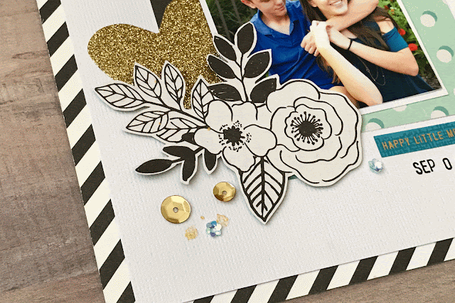
I'm excited to be sharing with you my second project for Citrus Twist using this wonderful sketch. I was drawn to the title on the vertical border, and I ended up staying true to the sketch.


The products that I used for this layout come from the Main, Embellishment, and PL kits.


These photos are from the first day of school. I love the phrases in the collection and find that they are extremely versatile. These phrases would also be great for a new job, moving, friendships...the list goes on and on. 


One of my favorite things on this page is this sweet bird and the speech bubble. It is so stinking cute!! Layering the labels underneath the bird gave him a sweet perch plus adds interest to the cluster. 


The main kit this month included doilies which are one of my favorite things to use to embellish my pages. 


I messed up on the stamping so I stamped on plain cardstock and covered it up. While it is not perfect, it is good enough and definitely not worth me tearing up the page like I've been known to do :)

Be sure and check out the Citrus Twist blog so that you can see what Veera created using the same sketch. Thanks so much for joining me today and I hope that you have a great day! I have included a link to my process video below if you'd like to take a closer look at how it came together.


Stuck?! Sketch Reveal

 It's time for another sketch to be revealed at Stuck?! Sketches and as always it is one that I love.


I challenged myself to scrap a photo that has been mocking me...the colors in it were challenging, and to top it off it is of a special place and I really wanted to do it justice. My jumping off point for this sketch was the black scallop border on the top. I'm not going to lie to you and say that this was an easy layout to make. The most challenging bit was finding colors that worked well with the photo, but having a sketch to help made creating the layout much easier.


The supplies that I used are from various Felicity Jane kits with the exception of the camera puffy sticker, small tile alphas, the chipboard phrases and enamel dots. They are all from Freckled Fawn


Although it is barely noticeable, I layered and distressed a thin border of pale pink paper between the top strip and the scallop border. I didn't want the top border to be too thick and heavy so keeping it thin helped to give it some extra texture without making it too heavy.


Black intimidates me yet I love it. It is hard for me to find a good balance without making the page feel dark and overwhelming. I envy other scrapbookers that effortlessly use dark colors and make them look fabulous.


I chose not to add journaling to this layout, but may go back and add it at a later date. Right now my plan is to create a couple of more pages that tell the story but I haven't figured out exactly which ones I want to use and how I am going to address the journaling. 


We'd love for you to join us and use our sketch! If you choose to do so, be sure and link up your creation on the blog to have a chance to win a prize from one of our sponsors. We are so thankful to have their support!


Here's the process video if you'd like to take a closer peek at how the page came together. Thanks so much for joining me today, and I hope that you have a great day :)


Saturday, October 7, 2017

Sweet Moments with Citrus Twist

I'm excited today to be sharing my first layout for Citrus Twist. The main scrapbook kit this month is right up my alley with the colors and patterned papers.


The rose gold foil accents in the collection are lovely. This butterfly is my favorite embellishment and I stitched through it not only to secure it, but for some added texture.


Hand stitching has been a love of mine since I was a little girl. These die cuts come to life with a bit of stitching in the centers. Choosing embroidery floss to match the die cuts made my stitching easier and gave me a bit of wiggle room in case my stitches were not quite on target.


To jazz up the background I chose a heavyweight acrylic paint by Liquitex and used a large dry brush to paint it on the background. I find that using the heavyweight paint that my paper does not buckle nearly as much, nor do I need to use gesso.


We all know that Thickers are notorious for not sticking to the page. These alphas have a gorgeous design which allowed my stitching to blend in. Subtle details are some of my favorite to add to my pages.


All of my supplies can be found in the Good Vibes Scrapbook Kit . I have a process video if you'd like to see how this page came together. Thanks so much for stopping by, and I hope you have a great day!


Sunday, October 1, 2017

October 1st Reveal for Stuck?! Sketches

Today I am excited to share with you another fabulous sketch designed by Laura for Stuck?! Sketches


I chose to stay pretty true to the sketch, but flipped the orientation since my photos looked better on the left side of the page.


Most everything used on this layout is from Maggie Holme's Carousel collection with the exception of the ivory button (unknown) and the pale blue flower sequins which are from Spiegelmom Scraps


The floral paper in the collection is perfect for fussy cutting. I love the way that the flowers look in the clusters around the page. 


As always, we'd love for you to play along with us at Stuck?! Sketches. If you do so, please upload your project to the blog to have a chance to win a prize from one of our sponsors listed below.


I have linked my process video if you'd like to take a peek on how the page came together. Thanks so much for joining me today, and I hope that you have a great day!