Saturday, December 31, 2016

Highlights of 2016

For the last challenge of this year, Mari and I decided to do a highlights page of 2016. This challenge proved to be one that I loved and I hope that you try this as well. For this layout, I ended up choosing 8 photos from the year, and making sure to include one of the entire family, and one of each child's passion (music and softball). 

In order to keep the focus on the photos, I printed them in black and white. The colors were all over the place and I did not want to worry about trying to find papers that would look good with all of them. These are stories that I have either already told in my album, or plan on telling, so I did not feel the need to have elaborate journaling included on the layout. Instead, I decided to have the focus be on the title, which is a bit unusual for me but I love the end result. Underneath the title I printed out captions for the photos and love the way that it fills in the space below the title. 


Using the Impact font, I used my Silhouette to cut out the year. If you do not own a die cutting machine, you can still achieve this by printing out numbers on paper, tracing them onto your background page, and then cutting them out with a craft knife. Once I backed the numbers I poked holes around the numbers and then proceeded to stitch around them with dark grey embroidery floss.


All of the supplies that I used are from my Felicity Jane kits, with the exception of the enamel dots, twine and embroidery floss.


 This is one of my favorite layouts from this past year. I will most certainly be doing this type of layout again next year and I hope that this inspired you as well. I have linked my process video if you'd like to take a peek at how this page came together. Be sure and check out Mari's video as well...her channel is linked in the details section of my video :)


Thursday, December 15, 2016

Stuck?! Sketches Reveal

It's the fifteenth of the month and that means it's time for the second sketch of the month from Stuck?! Sketches. I love this sketch...yes, I know that I always say that but I really mean it!


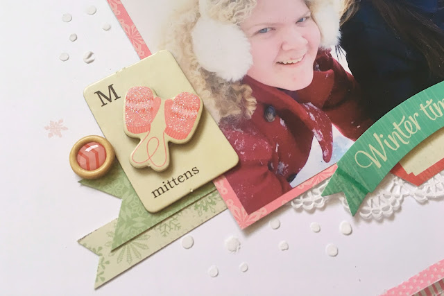
I decided to pull out my Crate paper Bundled Up collection from 2013 for this page. I fell in love with the colors and the snowman in this collection and it was so fun to use on this page. I stayed pretty true to the sketch altering sizes and directions to better suit my layout.


 On the background I used white modeling paste through a Heidi Swapp polka dot stencil. I didn't want to add a lot more to the background and thought that this was a great way of adding texture and visual interest.


 The snowflake stamp set is from HoneyBee that was a Clique Kit exclusive last year. 


I have a process video for this layout if you'd like to take a peek at the process :)


We would love for you to play along with us this month and show us your take on the sketch. Be sure and link it up on the blog for a chance to win a prize from one of these two sponsors.


Saturday, December 3, 2016

Scrap the Challenge #24 Mood Board

This week Mari and I decided to use a Christmas Mood Board as our inspiration. There are so many things that I love about this mood board. 

The colors are a bit softer, and the overall feel is light and bright. The ornaments have a vintage feel, the trees are gorgeous, and the pop of gold is just pure magic. There are so many ways to get inspiration from a mood board. Let me share some of the things that I thought of looking at this board. 

1. documenting a favorite ornament
2. finding papers that match the color scheme
3. documenting my love of Christmas florals
4. creating a page that has hanging ornaments as my design element
5. using jute, twine, a bow or ribbon on my page

As I was looking through my pictures from last year in December, I stumbled upon a photo that I had taken of my husband's craft tree that he decorated as a young boy. This immediately became my story that I wanted to tell.

After his mother died the family went to clean out her home. We found this special tree in storage. I couldn't believe that she kept it for so long (some 40+ years) and we happily took it home. The cardboard tree was decorated with gold tinsel, styrofoam egg cartons  for the ornaments, and sequins were glued on top. The tinsel was coming unglued, and styrofoam ornaments were cracking and falling off, and you could see that many ornaments had lost their sequins. I didn't just want to throw it away though, so I took a picture of it so that we could remember this sweet tree. 


I was inspired by a layout that I saw on the Felicity Jane Facebook group using the FJ cut file available in the Silhouette shop. I did use the single tree and made my own background by welding several of the trees together. The journaling will be added to the tag that is tucked in the kraft bag behind the photo.


I chose to change the muted colors in the mood board to those that are brighter but in the same color family. The bow in this cluster was also inspired by the board.


These alphas are one of my all-time favorites. I am running low on lower case vowels, so I alternated upper and lower case throughout the title.


The papers and word phrases are Crate Paper Snow & Cocoa, flair from Pretty Little Studio, gold alphas are Studio Calico, gold glitter hearts and enamel shapes are Freckled Fawn, and I'm not sure about the kraft bag.

Here is a link to my process video. Be sure and check out Mari's beautiful layout as well. I have linked her channel in the description box on my video. Have a wonderful day and I hope that this mood board inspires you like it did us!


Thursday, December 1, 2016

Stuck?! Sketches December 1st Reveal

Today I have a new layout up for Stuck?! Sketches and I have to say that the sketch is one of my favorites. When I first saw it my immediate thought was to scrap a Christmas layout since stars and Christmas just go together. However, I decided to scrap a photo of my daughter's softball team instead and love the way that it turned out.


I remained true to the sketch with the exception of adding a paper strip at the top of the layout. Most everything used on the layout is from my Felicity Jane kits with the exception of the Maggie Holmes puffy word stickers, and the branding strip at the bottom of the layout.


The colors in the uniforms are my albatross. I like to scrap pretty colors and burnt orange is just not my idea of a pretty color. I chose to ignore it and picked neutral papers and added a pop of yellow. The tiny black sequins are so cute. I tried for quite a while to make them have a random look in the clusters, and finally just decided to glue them down. 


Stitching straight lines is not always easy, especially around a shape. I started underneath the paper layers so that if my stitching did not line up it would not be noticeable. If I started stitching at one of the points on the star, the likelihood of me matching up the ends perfectly is practically zero. I'd have a better chance of winning the lottery :)


While the saying on this wood veneer piece isn't the most appropriate, it does work and I really liked the way that the banner looked underneath the title. Speaking of titles, let me just say how much I love these alphas from Felicity Jane. The white outline around the black letters just looks amazing. It's the little things that make my day!


I am going to go back and stamp the date on the labels. I didn't have it when I was making the page, and I forgot to do it before I took the pictures. I have a process video for this if you'd like to take a peek at my process.


We'd love for you to play along with us at Stuck?! Sketches and have a chance of winning a prize from one of these two sponsors. Have a wonderful day!